Activities of "mahmut.gundogdu"
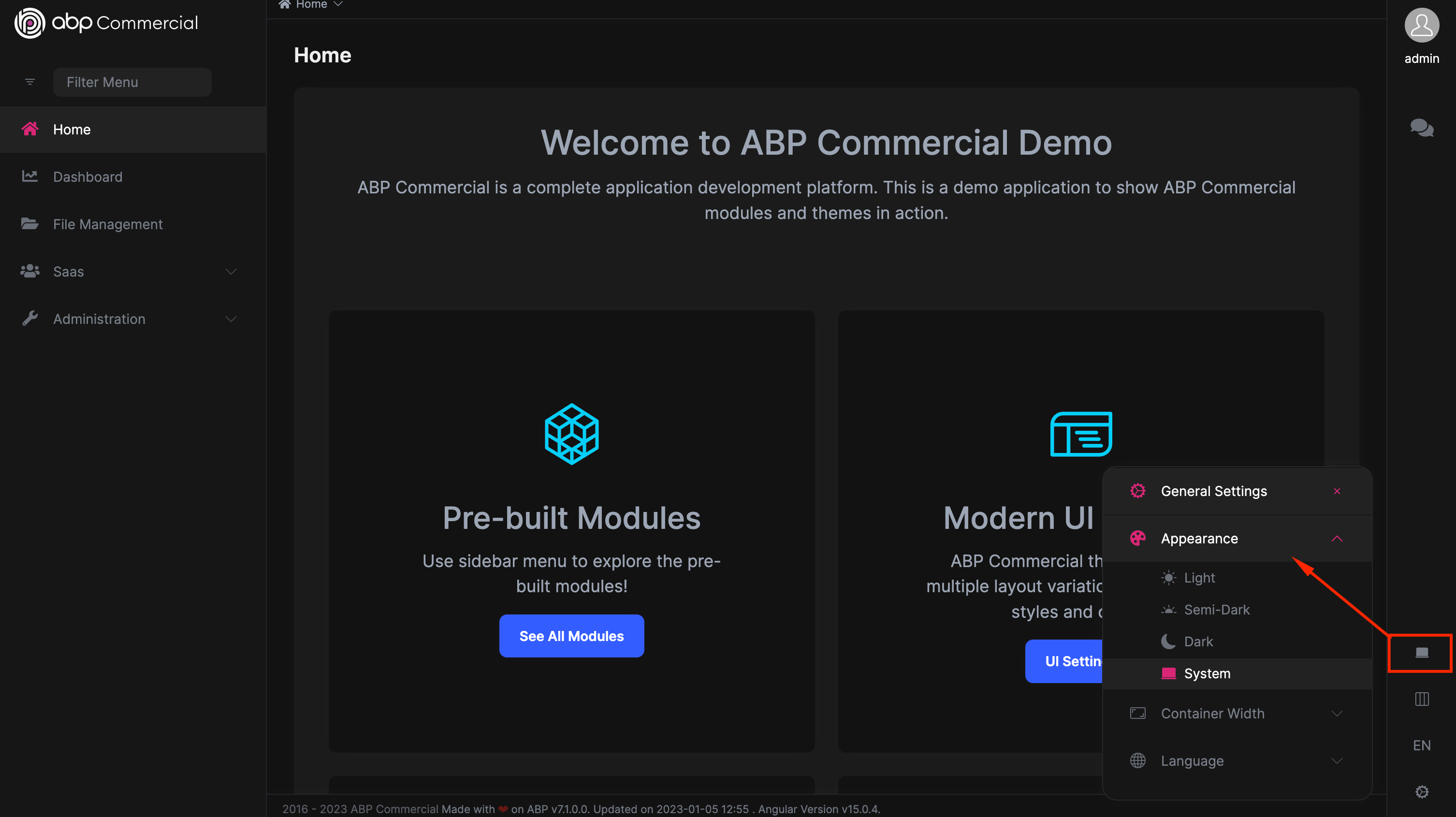
theme.service.ts is responsible for theme operation. that has the method name is "getInitialTheme". If you want to override, you can inherit the service and override the method.
systemMediaQueryList = this.window.matchMedia('(prefers-color-scheme: dark)');
the code detect dark or light. if you want to change by user interaction
In the upcoming release, we'll include a simpler method to choose the default theme. I created a task. but for now, you can use the token to choose the default.
{
    provide: LPX_THEMES,
    useValue:LPX_THEME_STYLES_DEFAULTS.map(item =>({
     ...item,
     defaultTheme: item.styleName === StyleNames.Light
}
In the upcoming release, we'll include a simpler method to choose the default theme. I created a task. but for now, you can use the token to choose the default.
{
    provide: LPX_THEMES,
    useValue:LPX_THEME_STYLES_DEFAULTS.map(item =>({
     ...item,
     defaultTheme: item.styleName === StyleNames.Light
}
Angular ABP framework uses the Ngx-validate (https://github.com/ng-turkey/ngx-validate) library for validation. Yes, it has a lack of documentation. We will fix that in the future. When using an input group, you should use the 'validationTarget' directive in the container element. here you can check the example https://stackblitz.com/edit/ngx-validate-nhbdby?file=src%2Fapp%2Fcomponents%2Fapp.component.html
There were breaking changes in V7.0. OAuth codes were relocated to new packages. Here you can check the angular section https://github.com/abpframework/abp/pull/15337/files?short_path=e56244f#diff-e56244fece49a709a76bf89ab104f8ebea9da142d8952faa2e1e33edb4379c18
The ABP CLI and app versions must be identical. I have tested the rel-5 app with the latest stable version of the ABP CLI. Although we usually advise using the most recent version of ABP, you might use this command to generate a proxy..
 yarn ng g @abp/ng.schematics:proxy-add

// or add package.json as script and run with npm
//    "generate-proxy":"ng g @abp/ng.schematics:proxy-add"
npm run generate-proxy
//or
npx ng g @abp/ng.schematics:proxy-add
The command will execute the local version of the schematics. It will create proxies successfully.
This information provided by TenantBoxService.
@Component({
  selector: 'my-tenant-box',
  templateUrl: './my-tenant-box.component.html',
  providers: [TenantBoxService]
})
export class MyTenantBoxComponent {
  constructor(public service: TenantBoxService) {}
}
here the HTML . https://gist.github.com/mahmut-gundogdu/5334cbeb92d068a6534c8ae7d5212c47 (I must store my code on gist because angular double curly braces produce a difficulty on the editor of abp support web site )
Hi ABP Support,
Thanks for your support about the way to change the lepton login. It works fine. But we also have to add the TenantBox part above the login. Can you help me how to do that?
Thanks
Hi tommy.reynolds@pentair.com, Could you please create a new ticket ? I don't want to bother the owner of the question with our notifications.
https://github.com/abpframework/abp/blob/dev/npm/ng-packs/packages/components/tree/src/lib/components/tree.component.ts
The CSS installs only when the tree component is used in the template. and the CSS is only for tree component. you can implement your issue with ABP Lazy load service https://docs.abp.io/en/abp/latest/UI/Angular/Lazy-Load-Service
The customization document is missing. We will write better docs.

